Responsive Design for
a Streaming Service

About the project
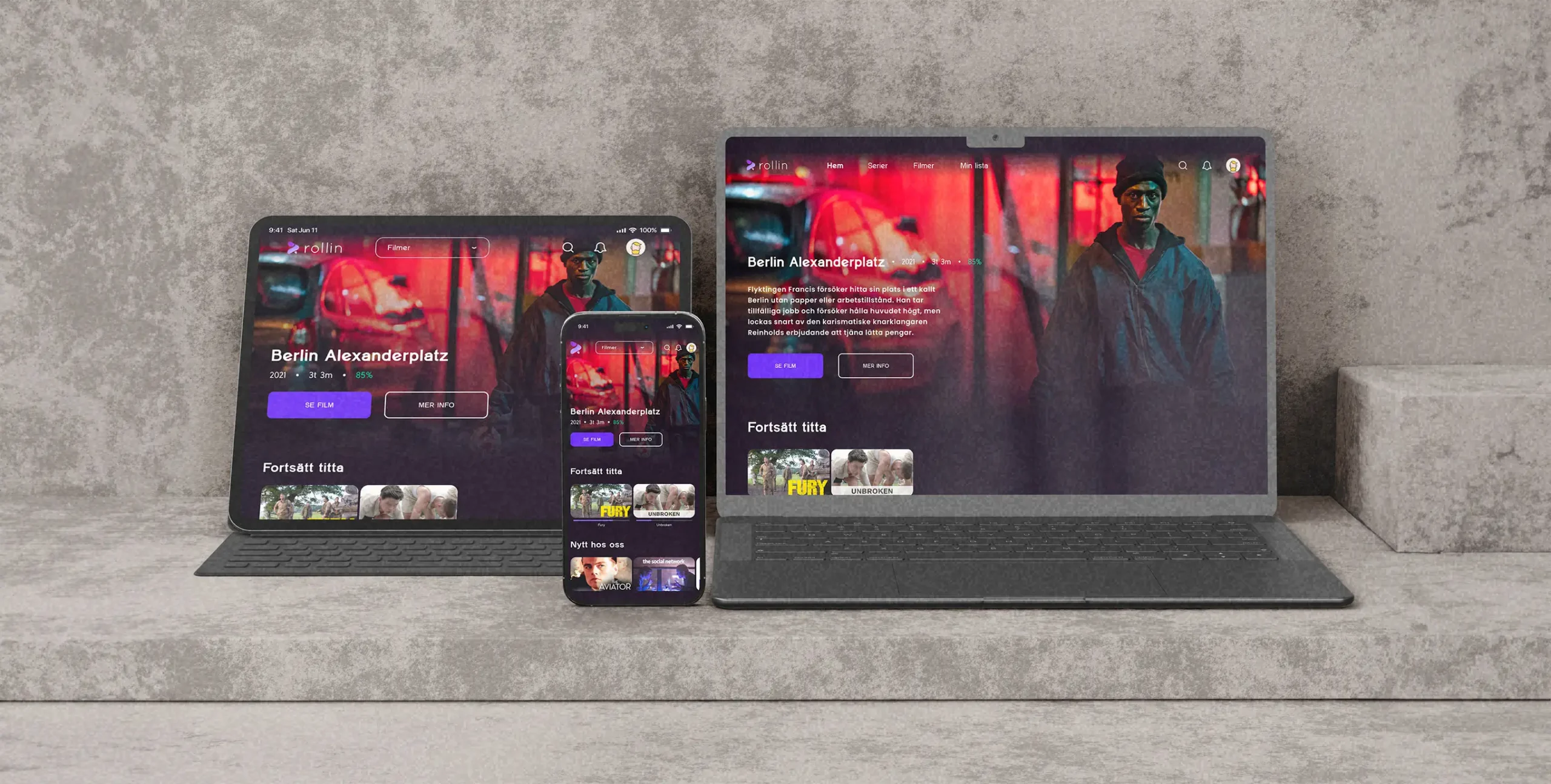
The project focuses on creating a user-centered and responsive streaming service. By implementing consistent and familiar design elements to ensure users feel comfortable and oriented, and simple navigation to reduce cognitive load and make interactions straightforward, the design guarantees a seamless experience across all devices, ensuring an intuitive and engaging streaming experience.

Research & Planning

Planned the project, conducted interviews, and generated a persona, focusing on understanding the user and existing services to align the product design with needs and preferences effectively.

Scope

Took time to understand the scope for effective project planning, ensuring quality throughout the entire project, and a successful completion.
Design a Streaming Service.
Scalable design for at least 3 different screen sizes.
Create a clickable prototype using Figma.
Conducted interviews and developed a persona to identify pain points and gain insights into user goals, needs, and motivations.

Interviews & Persona

Emma, 28 years old
Graphic Designer Student
Location: Gothenburg
Emma is a 28-year-old graphic designer student living in Gothenburg, Sweden. She is open-minded and enjoys spending her evenings and weekends exploring new TV shows and movies to watch. Emma is experienced when it comes to digital technology and frequently uses various streaming services and social media platforms.
Frustrations
Limited selection of series and movies.
Difficulty in resuming a show or movie from where she left off.
Navigating a confusing interface to find desired content.
Motivations
The joy in discovering new series and movies that she likes.
To relax after a busy day in school.
Watching her favorite series and movies.
User Needs
A wide range of series and movies to choose from.
Recommendations that reflect her viewing habits and interests.
Familiarity and consistency with features from other streaming services.
User Goals
To stay updated with the latest releases and trending content.
To have a reliable streaming service that performs well on all her devices.
To discover new and interesting content without spending too much effort.

Solutions

Prioritized features to match frustrations, motivations, user needs, and goals, ensuring a user-centered approach throughout the design process.
Consistent and familiar elements.
Simple navigation to reduce cognitive load.
A wide range of series and movies.
Seamless experience on all devices.

Layout & Structuring

Ensured consistency in design elements while adapting grids, typography, and components to fit the specific needs of laptops, tablets, and mobile phones.

Grids

Created a responsive grid system, ensuring a consistent layout and alignment across all devices throughout the platform.
Defined the user journey within the platform to streamline interactions, enhancing the overall 
user experience.

Navigating User Journeys

Wireframes

Created wireframes to build the website’s structural framework, with a focus on enhancing functionality and user flow, allowing for quick testing and iterations.
Developed the branding elements for the platform, including colors, logo, typography, and reusable, scalable components.

Branding and Components

Colors
Deep Purple
5F2EEA
Frost
D9DBE9
Midnight
1C1522
Royal Purple
6A3093
A044FF
Soft Violet
7B61FF
BCA4FF
Vibrant and eye-catching colors that attract user attention. The colors create a cohesive visual experience and maintain a unified visual theme, while supporting a modern, clean, and minimalistic interface.
Other
Success
1FC58E
Error
F44336
Logotype
Typeface
Clear and easy to read with a modern and professional look, it provides a cohesive visual experience and maintains a minimalistic design that keeps the focus on the content.
Regular
Medium
Bold
Black
Components
Reusable and auto-layout components that simplify design work, maintaining a consistent interface, and adapting to various screen sizes, offering a flexible and efficient design system.
Prototyping

Sign In

Each screen maintains consistent branding and functionality, offering flexibility by allowing users to choose their preferred login method.

Homepage / Movies / Series

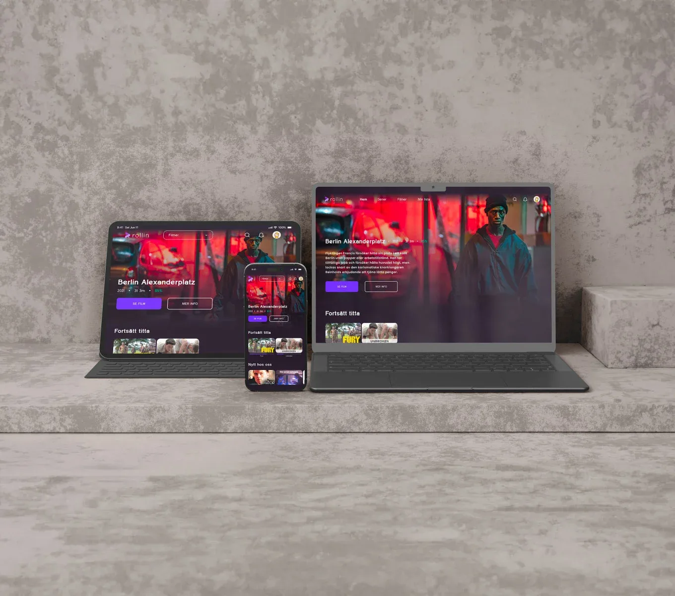
The design employs a clear visual hierarchy, prominently placing important content to guide user attention effectively. It maintains a consistent aesthetic with a dark theme and vibrant images, creating a cohesive interface. The use of space maximizes screen real estate, displaying more content on larger screens without cluttering, while keeping smaller screens user-friendly. Key interactive elements, such as buttons for watching or obtaining more information, are clearly visible and easy to use.

More Information

The design features a clear visual hierarchy, with important elements prominently placed. Elements are easy to find and use, and the use of space is optimized to display content without cluttering, no matter the screen size, making navigation intuitive and enjoyable.

Video Playback Screen

The design balances functionality and aesthetics, ensuring an enjoyable viewing experience across different devices. The interface remains user-friendly and consistent, providing all necessary controls and information in an accessible manner, whether on a mobile phone, tablet, or desktop.

Think I’d fit your project?

Get in touch

© Gustav Karlsson 2024